
This article discusses population statistics and data normalization capabilities, which utilize population-level data to provide relevant context to improve metric interpretation and usability.
Overview
Our human data platform enables a comprehensive approach to human data collection, analysis, and operationalization. One key consideration for analyzing and interpreting human data is the context of individuals' data with respect to their cohort, demographics, organization, or population.
Population statistics enable data normalization, which adjusts data values to a common scale to improve the accuracy and usefulness of this data within the context of a user's demographics or environment. Cohort capabilities provide further insight into subpopulations that are relevant to users. In addition to the raw values for metrics, normalized values, which adjust metrics to a standard scale to ease interpretation and understanding, are also often available in real time. The result of this normalization process transforms raw measurements into t-scores and percentiles, providing typical ranges for metrics to improve interpretation and usefulness.
Data Normalization
Normalizing data is when data values are adjusted to a common scale based on population statistics. Z-scores and percentiles are two familiar ways to normalize data, commonly used in standardized educational testing and healthcare.
Population statistics and normalization provide key benefits to improving data interpretation and providing relevant context.
The visual below shows a variety of ways data can be normalized. In this graphic, population (or cohort) data is plotted along a normally distributed curve to determine the mean (or average) and standard deviation (or variation), enabling the data to be displayed and interpreted through the context of that population or cohort.
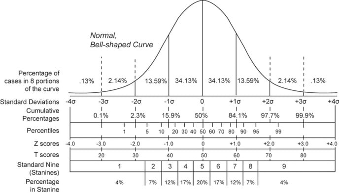
Z-scores, a well-known technique, normalize the data so that 0 represents the mean or average and the standard deviation (SD) is 1. T-scores use a similar approach to z-scores, although the specifics of the normalization process vary across different fields. Within the Trinsic platform, the T-score values are scaled such that the mean is 50, and the SD is 10 (as is common in the psychometric and educational research fields).
Normalizing raw metrics as t-scores was first suggested by researchers to simplify the interpretation of bone density results. This normalization enables practitioners and individuals to understand how a patient’s bone density results compare to a population or cohort instead of attempting to interpret the raw value. For example, a BMD score of 35 (or -1.5) can be easily interpreted as one and a half standard deviations below the mean, while a raw BMD score of 0.928 g/cm2 would require more contextual information, familiarization, or existing knowledge and experience for interpretation. T-scores are additionally utilized commonly in standardized psychological testing.
Simplifying complex or unfamiliar metrics is relevant for interpreting many metrics derived from human data. While some metrics derived from time-series data are easily interpretable (Average Heart Rate displayed in beats per minute or Jump Height displayed in centimeters), many derived metrics and their typical ranges are unfamiliar to human health and performance practitioners.
Normalization Prerequisites
Normalization capabilities require a sufficient quantity and quality of data to apply population statistics to a data source of interest appropriately. This means that either an organization has the data to meet this requirement or this requirement is met by leveraging anonymized data from common sources across our user base. Normalization capabilities are available for many data sources out-of-the-box and can be iteratively developed for organizations when sufficient data is available. Cohort normalization capabilities provide further context specific to subpopulations or cohorts (e.g., females 18-22) and similarly require sufficient data to deploy.
As a standard, data within your platform will be normalized based on the Default population or cohort selected. Alternate or additional Cohorts can be utilized if enabled/available - contact your Customer Success Manager for more information.
T-Scores and Percentiles
T-scores and percentiles represent two common yet different ways to normalize data for interpretation (see graphic above).
T-Scores
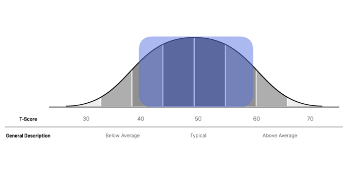
This normalization transforms scores so that the population average or mean equals 50, and one standard deviation equals 10. For a user with a score of 50, this can be interpreted as the user’s score being “Average” compared to the default population or cohort. The typical range of t-scores for the default cohort is between 40 and 60, including one standard deviation (10) on either side of the mean. This can also be explained as the majority (around 70%) of the default population or cohort’s values fall within that range. Scores above and below 50 are “above average” and “below average,” respectively.
T-scores provide a useful normalization tool to transform unfamiliar metrics into a more standard scale. For values or metrics where a higher score isn’t always perceived as better, t-scores may be an optimal way to communicate scores as there is less intuition around what is “good” or “bad.” Additionally, for many metrics, “Average” or “Normal” is considered an acceptable or even optimal value (e.g., BMI, Blood Pressure).
The Cohorts capability (see more below) allows users to toggle between alternate cohorts or subpopulations. Leaving user scores unchanged, toggling Cohorts provides more specific t-score typical ranges when selected.
Percentiles
Reporting percentiles may be more familiar and can be more intuitive for communicating where a user’s score “ranks” compared to their peers. The 50th percentile is the median score for the selected population or cohort. For a user with a result of the 50th percentile, this can be interpreted as the user’s score is “Average” compared to the selected population or cohort. For a user with a result of the 75th percentile, this can be interpreted as a score higher than three-quarters (75%) of similar users. This can also be explained as “Higher than Average” compared to similar users.
Percentiles are often reserved for high-level metrics where a higher score can be perceived as “better.” Most users are more familiar with the concept of percentiles, with the image above providing some optional nomenclature to support communicating percentiles to users. One drawback of percentiles is that there can be higher variability over time due to how the normalization occurs. T-scores will often provide more stability for metrics that may be preferred for reporting and documentation purposes.
The Cohorts capability (see more below) allows users to toggle between alternate cohorts or subpopulations. Percentiles are dynamically updated based on a selected cohort to improve interpretation.
Additional Normalization Approaches
A large variety of additional normalization approaches exist, as do additional considerations arise based on the behavior of different metrics (e.g., non-gaussian distribution). Our platform is not limited to the normalization approaches broadly discussed here. The approach is to apply modern data science optimizations to established clinical best practices in order to provide the most useful insights to support decision-making in real-world environments. To achieve this, a series of complex decisions are made (e.g., what normalization techniques, what types of models, and what visualizations) to generate these optimized results. We use various standard statistical, computational, and machine-learning tools to accomplish this and are happy to provide more detailed information and normalization capabilities upon reasonable request.
Cohort-Based Normalization
The Cohort capability performs relevant population statistics to available subpopulations (or cohorts) to show where users' metrics fall relative to various more specific groupings in real-time. This capability provides a layered approach, enabling organizations to consume data through a flexible context-relevant lens.
Learn more about cohort-based normalization in the article: How to Use the Cohorts Capability
General Interpretation Guidelines
The accurate interpretation of data requires context; thus, score interpretation is often context-dependent. Additional articles discussing specific metrics should be reviewed to improve specific interpretation.
For t-scores, 40 to 60 are typical for the default cohort or population, while values falling outside of those may warrant further investigation.
 Similarly, users can interpret scores with respect to an alternate cohort’s typical range, with values falling outside of that range perhaps warranting further investigation. An atypical score shouldn’t automatically be considered “bad,” as a typical score shouldn’t automatically be considered “good,” as the context here is critical.
For t-scores, 40 to 60 are typical for the default cohort or population, while values falling outside of those may warrant further investigation
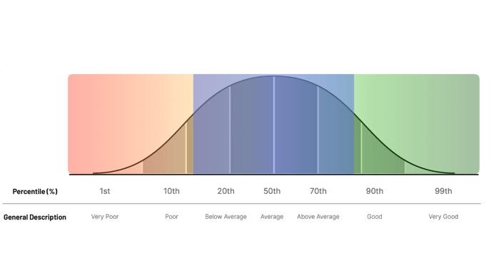
Percentiles are typically more familiar to users and should generally be utilized when higher scores are considered “better.” The image above provides some general nomenclature that can be utilized to communicate percentiles (e.g., poor, average, good). These terms may not always align with subject matter expertise and should be utilized appropriately.